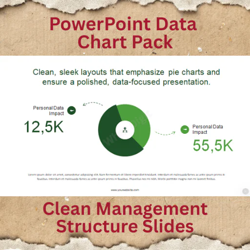
Clean Percentage & Data Breakdown Visuals
The 16 Modern Animated Pie Chart Infographics pack is built for professionals who need to present data distribution, percentages, and proportional comparisons clearly and visually.
Pie charts are simple — but poorly designed ones create confusion.
This pack delivers modern, structured, animated pie charts that guide attention and improve understanding during live presentations.
If your presentation includes data breakdowns, this tool saves time and increases clarity.
Why Animated Pie Charts Matter
Static charts often overwhelm audiences.
Controlled animation helps:
Reveal data step-by-step
Highlight key segments
Improve engagement during reporting
Support storytelling with numbers
This template keeps motion subtle and professional.
Key Features
16 modern animated pie chart slides
Clean, contemporary design
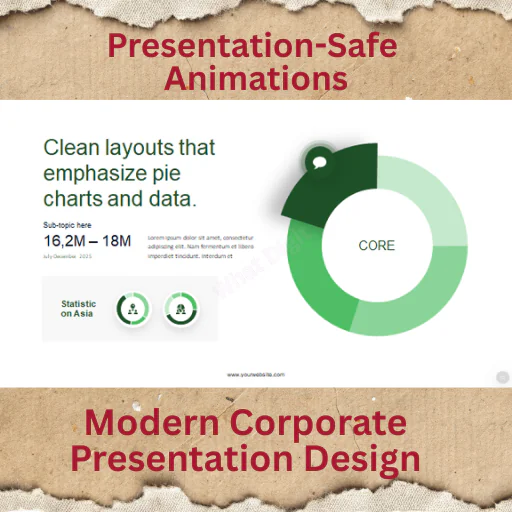
Smooth, presentation-safe animations
Fully editable percentage values
Easy color customization
Data labels & text placeholders
Master slide–based structure
Vector-based chart elements
Full HD resolution
Documentation file included
Built for clarity, not decoration.
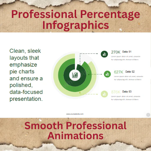
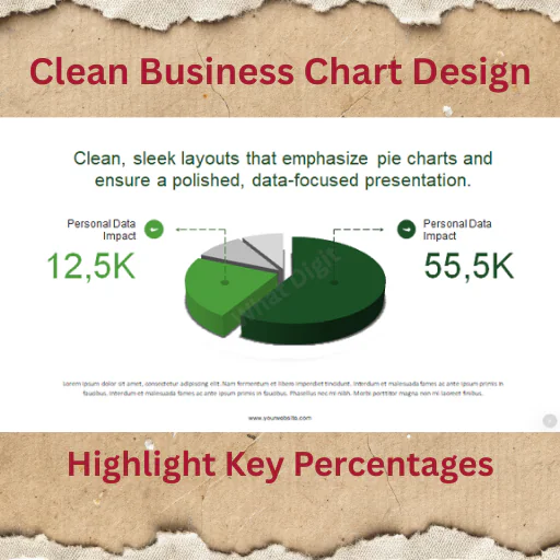
Slide Types Included
Single data breakdown pie charts
Multi-segment comparison charts
Highlighted percentage focus slides
Data storytelling layouts
Minimal corporate-style pie charts
Designed for business, reporting, and analysis.
Files Included
PowerPoint (.PPTX)
PowerPoint (.PPT)
Documentation file
✔ Works on PowerPoint (Windows & Mac)
✔ Google Slides via import (animations may vary)
❌ Keynote not included
Best For
Sales & marketing reporting
Business performance reviews
Financial summaries
Startup pitch decks
Corporate reporting
Academic data presentations
If you present percentages regularly, this becomes your go-to visual pack.
Important Notes
Preview images are for demonstration only
No stock images included
No plugins required
Charts fully editable inside PowerPoint
Designed for presentation use
Case Example: Quarterly Sales Review
A sales manager used these pie charts for a quarterly report:
Before:
Excel screenshots pasted into slides.
After using this template:
Clear animated breakdown of revenue sources
Highlighted underperforming segments visually
Improved executive engagement
Result: Faster decision-making and fewer clarification questions.
Good visuals make data easier to act on.
Published:
Feb 17, 2026 01:26 PM
Category:
Tags: