


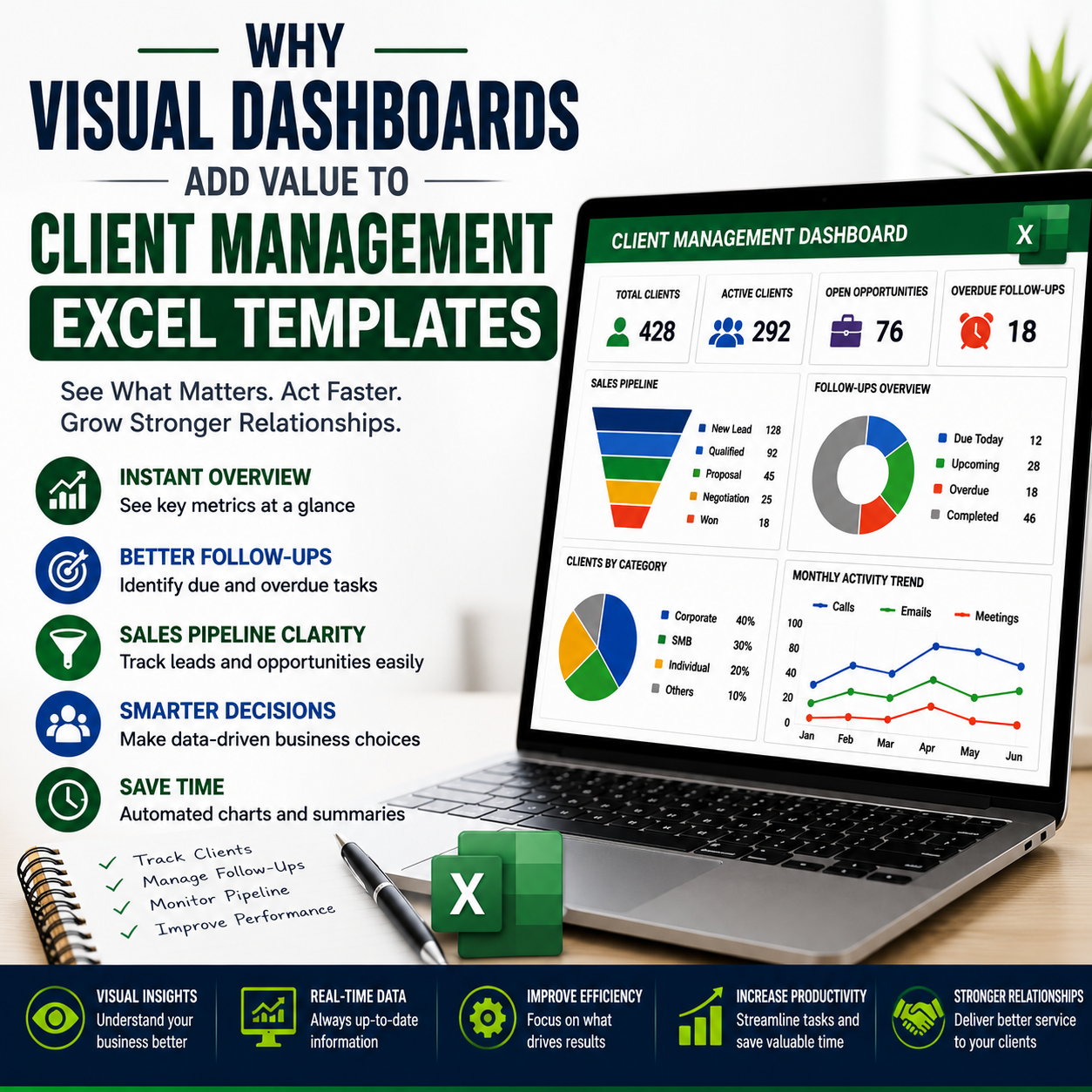
Why Visual Dashboards Add Value to Client Management Excel Templates
Discover how visual dashboards make client management Excel templates more useful by improving follow-up visibility, sales tracking, reporting, and business decisions.
Managing client information in Excel is straightforward when a business has only a few customers. As the number of clients, leads, conversations, follow-ups, opportunities, and activities increases, however, a spreadsheet can become difficult to interpret. Rows of data may contain valuable information, but finding the most important information quickly becomes a challenge.
This is where visual dashboards add significant value to client management Excel templates.
A dashboard converts detailed spreadsheet data into a visual summary of important business activities. Instead of manually reviewing hundreds of rows, users can quickly identify client counts, pending follow-ups, sales opportunities, pipeline stages, overdue activities, and other key indicators.
The purpose of a dashboard is not simply to make an Excel template look professional. Its real purpose is to make business information easier to understand and act upon.
What Is a Visual Dashboard in a Client Management Excel Template?
A visual dashboard is a dedicated worksheet that summarizes information from the underlying client-management data.
It can use:
- KPI cards
- Charts
- Graphs
- Tables
- Status indicators
- Progress bars
- Filters
- Conditional formatting
- Summary metrics
- Pipeline visualizations
For example, a client management dashboard might display the total number of clients, active prospects, pending follow-ups, overdue activities, open opportunities, and estimated pipeline value.
Instead of searching through individual records, the user gets a high-level overview in one location.
This makes the spreadsheet function more like a lightweight management system rather than simply a database.
Why Raw Client Data Is Not Enough
A client database can contain hundreds or thousands of records. Although the information may be accurate, raw data does not automatically provide insight.
Consider a spreadsheet containing:
- 500 client records
- 200 active leads
- 75 open opportunities
- 40 overdue follow-ups
- 25 proposals
- 15 recently won clients
All of this information could be stored in Excel, but a manager would still need to filter, sort, calculate, and interpret the records to understand the current situation.
A dashboard can summarize these figures immediately.
This distinction is important:
Data tells you what exists. A dashboard helps you see what matters.
Visual Dashboards Improve Decision-Making
One of the biggest advantages of a dashboard is faster interpretation.
Managers frequently need answers to questions such as:
- How many active clients do we have?
- How many leads are currently being followed?
- Which follow-ups are overdue?
- How many opportunities are in negotiation?
- What is the current pipeline value?
- Which sales stage contains the most opportunities?
- How many clients were added this month?
- How many activities have been completed?
Without a dashboard, answering these questions may require manual filtering and calculations.
With a properly designed dashboard, many of these answers can be visible immediately.
This does not make the underlying data more accurate by itself. It simply makes existing information easier to interpret.
Dashboards Make Follow-Up Management More Visible
Missed follow-ups are one of the common problems in client management.
A client may have been contacted last week, but if the next action is buried inside a large spreadsheet, it can easily be overlooked.
A dashboard can highlight:
- Follow-ups due today
- Upcoming follow-ups
- Overdue follow-ups
- Completed follow-ups
- High-priority clients
- Clients without recent activity
This creates a visual layer over the detailed client records.
For example, a dashboard could show:
12 Follow-Ups Due Today
7 Overdue
28 Upcoming
46 Completed This Month
The numbers themselves are simple. Their value comes from making the current workload immediately visible.
Visual Indicators Help Prioritize Work
Not every client requires the same level of attention.
A dashboard can help users distinguish between routine activities and urgent items.
For example, conditional formatting or status indicators can categorize records as:
- On Track
- Due Soon
- Overdue
- High Priority
- Completed
- Inactive
This allows a salesperson or account manager to prioritize their time.
Instead of reviewing every client equally, they can focus first on records requiring immediate action.
That is particularly useful when managing a large number of relationships.
Dashboards Improve Sales Pipeline Visibility
Client management and sales management often overlap.
A business may have leads at different stages of the sales process:
- New Lead
- Qualified
- Contacted
- Meeting Scheduled
- Proposal Sent
- Negotiation
- Won
- Lost
A dashboard can visualize the number or value of opportunities at each stage.
A pipeline chart can reveal whether opportunities are concentrated at the beginning of the sales process or moving toward conversion.
For example, if a business has many new leads but very few proposals or negotiations, the dashboard may indicate that the business needs to examine its qualification or conversion process.
The dashboard does not diagnose the problem automatically. It makes the pattern easier to notice.
KPI Cards Create Immediate Visibility
KPI cards are one of the simplest dashboard elements.
A KPI card can display a single important metric prominently.
Examples include:
- Total Clients
- Active Leads
- Open Opportunities
- Overdue Follow-Ups
- Pipeline Value
- Won Deals
- Monthly Revenue
- Completed Activities
These indicators allow users to understand the current state of client-management activity within seconds.
However, KPI cards should be limited to genuinely useful metrics. Filling a dashboard with dozens of numbers can make it harder rather than easier to understand.
Charts Make Trends Easier to Identify
Tables are excellent for detailed information, but charts can make patterns easier to recognize.
A client management dashboard might use:
Column Charts
Useful for comparing:
- Leads by month
- Clients by category
- Opportunities by sales stage
- Activities by employee
Line Charts
Useful for monitoring trends such as:
- New clients over time
- Monthly activities
- Follow-up completion
- Sales opportunities
Pie or Doughnut Charts
Useful for showing proportions such as:
- Client status
- Lead sources
- Customer categories
- Opportunity stages
Funnel Charts
Useful for illustrating movement through a sales pipeline.
The chart type should match the information being communicated. Using a chart simply because it looks attractive does not necessarily improve the dashboard.
Dashboards Reduce the Need for Manual Reporting
Without a dashboard, managers may need to prepare recurring reports manually.
This can involve:
- Filtering the client database.
- Counting records.
- Calculating totals.
- Creating charts.
- Updating summaries.
- Repeating the process every week or month.
A well-structured Excel dashboard can automate many of these calculations through formulas, tables, pivot tables, or other Excel functionality.
Once the underlying data is updated correctly, the dashboard can refresh the relevant metrics.
This can reduce repetitive reporting work.
Dashboards Create a Central Management View
Another major benefit is centralization.
Client information might otherwise be distributed across:
- Contact lists
- Sales spreadsheets
- Follow-up notes
- Task lists
- Email records
- Separate reports
A client management Excel template can bring relevant operational information into a structured workbook, while the dashboard provides the central overview.
This does not replace every business system. It simply creates a consolidated management view within Excel.
Visual Dashboards Improve Team Accountability
Dashboards can also be useful for teams.
For example, a manager could monitor:
- Activities completed by each employee
- Open opportunities by owner
- Follow-ups assigned to each salesperson
- Overdue tasks
- Client distribution
- Sales performance
This can make ownership more visible.
If a follow-up is assigned to a specific team member and remains overdue, the issue becomes easier to identify.
However, dashboards should be used as management tools rather than surveillance tools. Poorly designed performance metrics can encourage employees to optimize the numbers instead of improving actual client relationships.
Dashboards Help Identify Problems Earlier
One of the strongest arguments for dashboards is early visibility.
Suppose a business normally generates 30 qualified leads each month but suddenly receives only 12.
The underlying spreadsheet contains that information, but without a summary, the decline may not be obvious.
A dashboard showing monthly lead trends could make the change immediately visible.
Similarly, a dashboard may reveal:
- Increasing overdue follow-ups
- Declining new-client acquisition
- Falling activity levels
- Pipeline contraction
- Excessive opportunities stuck in one stage
- Increasing inactive clients
Early visibility gives management an opportunity to investigate before a small issue becomes a larger operational problem.
Dashboards Make Client Management Excel Templates More Valuable
A basic client spreadsheet mainly stores information.
A more advanced client management template can help users:
- Store client information
- Track leads
- Manage follow-ups
- Monitor activities
- Track sales opportunities
- Analyze client status
- Review performance
- Generate management insights
The dashboard is the layer that connects these functions from a management perspective.
This is why visual dashboards can significantly increase the practical value of a client management Excel template.
The important point is that the dashboard should be connected to useful underlying data. A beautiful dashboard with unreliable formulas is worse than a simple but accurate report.
What Should a Client Management Dashboard Include?
The exact dashboard design depends on the business, but a practical dashboard may include the following sections.
Client Overview
- Total clients
- Active clients
- New clients
- Inactive clients
- Clients by category
Follow-Up Overview
- Follow-ups due today
- Upcoming follow-ups
- Overdue follow-ups
- Completed follow-ups
Sales Overview
- Total leads
- Qualified leads
- Open opportunities
- Won opportunities
- Lost opportunities
- Pipeline value
Activity Overview
- Calls
- Emails
- Meetings
- Tasks
- Completed activities
Trend Analysis
- Monthly client growth
- Lead trends
- Sales activity
- Follow-up completion
- Opportunity movement
Not every template needs every section. The dashboard should reflect the actual business workflow.
A Dashboard Should Not Replace the Client Database
One common mistake is treating the dashboard as the primary data-entry area.
That can create unnecessary complexity.
The detailed client database should remain the source of operational information, while the dashboard should summarize that information.
A sensible structure might be:
Sheet 1: Dashboard
Sheet 2: Client Database
Sheet 3: Leads / Pipeline
Sheet 4: Follow-Ups
Sheet 5: Activities
Sheet 6: Settings / Lists
The exact structure can vary, but separating raw data from reporting generally makes the workbook easier to maintain.
Accuracy Is More Important Than Visual Design
A professional dashboard should look good, but accuracy comes first.
A dashboard showing incorrect client counts or outdated pipeline values can lead to bad decisions.
Therefore, a good client management Excel template should use:
- Reliable formulas
- Consistent data structures
- Controlled input fields
- Standardized categories
- Clear calculation logic
- Proper error handling
- Clearly defined data sources
Users should also understand which cells require manual input and which cells are automatically calculated.
Too Much Visualization Can Reduce Usability
More charts do not automatically create a better dashboard.
A dashboard containing 15 charts, 30 KPI cards, and multiple complicated filters can overwhelm users.
The goal should be clarity.
A good dashboard answers the most important questions quickly.
A useful test is:
Can the user understand the current client-management situation within 10–20 seconds?
If not, the dashboard may need simplification.
Who Benefits Most From Client Management Dashboards?
Dashboards can be useful for several types of users.
Freelancers
Freelancers can monitor clients, pending follow-ups, active projects, and upcoming activities.
Sales Professionals
Salespeople can track leads, opportunities, pipeline stages, and follow-up requirements.
Consultants
Consultants can monitor active clients, engagements, meetings, tasks, and account activity.
Small Businesses
Small businesses can use dashboards to monitor overall client growth, sales activity, and relationship-management workload.
Sales Managers
Managers can use dashboards to review team activity, opportunities, follow-ups, and pipeline performance.
The larger and more active the client base becomes, the more useful centralized visibility can become.
Are Visual Dashboards Worth Paying More For?
A dashboard can justify a higher price when it provides meaningful functionality.
However, buyers should not assume that every dashboard adds value.
Before purchasing a client management Excel template, evaluate:
- Are dashboard calculations automated?
- Does the dashboard update when data changes?
- Are the metrics relevant?
- Can users filter the information?
- Are the charts connected to actual data?
- Is the dashboard easy to understand?
- Can it be customized?
- Are instructions provided?
A dashboard that requires users to manually update every number may offer much less value than one that automatically summarizes the underlying records.
How to Evaluate a Client Management Excel Template
Before purchasing or implementing a template, check the complete workflow.
Step 1: Review the Data Structure
Determine how client information is stored.
Step 2: Check Follow-Up Tracking
Make sure upcoming and overdue activities can be identified.
Step 3: Examine the Dashboard
Look at the metrics, charts, filters, and summary sections.
Step 4: Test Data Updates
Determine whether adding new client records updates dashboard calculations automatically.
Step 5: Check Customization
See whether categories, statuses, stages, and fields can be modified.
Step 6: Review Documentation
A professional template should provide enough instructions to understand how the workbook operates.
10 Frequently Asked Questions
What is a visual dashboard in Excel?
A visual dashboard is a worksheet that summarizes detailed spreadsheet information using KPIs, charts, tables, indicators, and other visual elements. In client management, it can provide an overview of clients, leads, follow-ups, activities, and sales opportunities.
How does a dashboard improve client management?
It makes important information easier to see and interpret. Instead of reviewing individual records, users can quickly identify overdue follow-ups, active clients, pipeline opportunities, and other key metrics.
Can an Excel dashboard prevent missed follow-ups?
It can reduce the likelihood of missed follow-ups by making upcoming and overdue activities more visible. However, it cannot guarantee that a follow-up will happen. The underlying data must be updated correctly, and users still need to take action.
What KPIs should a client management dashboard track?
Common KPIs include total clients, active clients, new leads, open opportunities, overdue follow-ups, completed activities, pipeline value, won opportunities, and client growth. The appropriate KPIs depend on the business model.
Do small businesses need a client management dashboard?
Not necessarily. A small business with a few clients may be perfectly comfortable using a simple spreadsheet. A dashboard becomes more useful as the number of clients, leads, activities, and management decisions increases.
Can Excel dashboards update automatically?
Yes, depending on how the workbook is designed. Formulas, Excel Tables, PivotTables, PivotCharts, and other Excel features can be used to create dashboards that update when underlying data changes.
Are Excel dashboards better than CRM software?
Not universally. Excel can be practical and affordable for smaller or simpler workflows. Dedicated CRM software generally offers stronger automation, collaboration, integrations, permissions, and scalability. The appropriate choice depends on the organization's requirements.
Can a client management dashboard be customized?
Many dashboards can be customized. Users may be able to change categories, KPIs, charts, pipeline stages, filters, and other elements. The extent of customization depends on how the workbook was designed.
What makes a dashboard professional?
A professional dashboard combines accurate data, logical organization, relevant KPIs, readable charts, consistent formatting, intuitive navigation, and reliable calculations. Visual appearance matters, but functionality and accuracy matter more.
Should every client management Excel template have a dashboard?
No. A dashboard is valuable when the user needs summary reporting and quick visibility. For very simple client tracking, adding a dashboard may introduce unnecessary complexity. The right template should match the actual workflow.
Conclusion
Visual dashboards add value to client management Excel templates because they transform detailed records into information that can be understood quickly.
They can make follow-ups more visible, improve sales pipeline monitoring, simplify recurring reporting, highlight trends, support prioritization, and give managers a centralized view of client activity.
But the dashboard itself is not the product's main source of value. Its usefulness depends on the quality of the underlying data, formulas, workflow, and reporting structure.
The strongest client management Excel templates therefore combine structured data + practical tracking + reliable calculations + useful visualization.
That combination turns an ordinary spreadsheet into a more effective business-management tool.
Comments (0)