


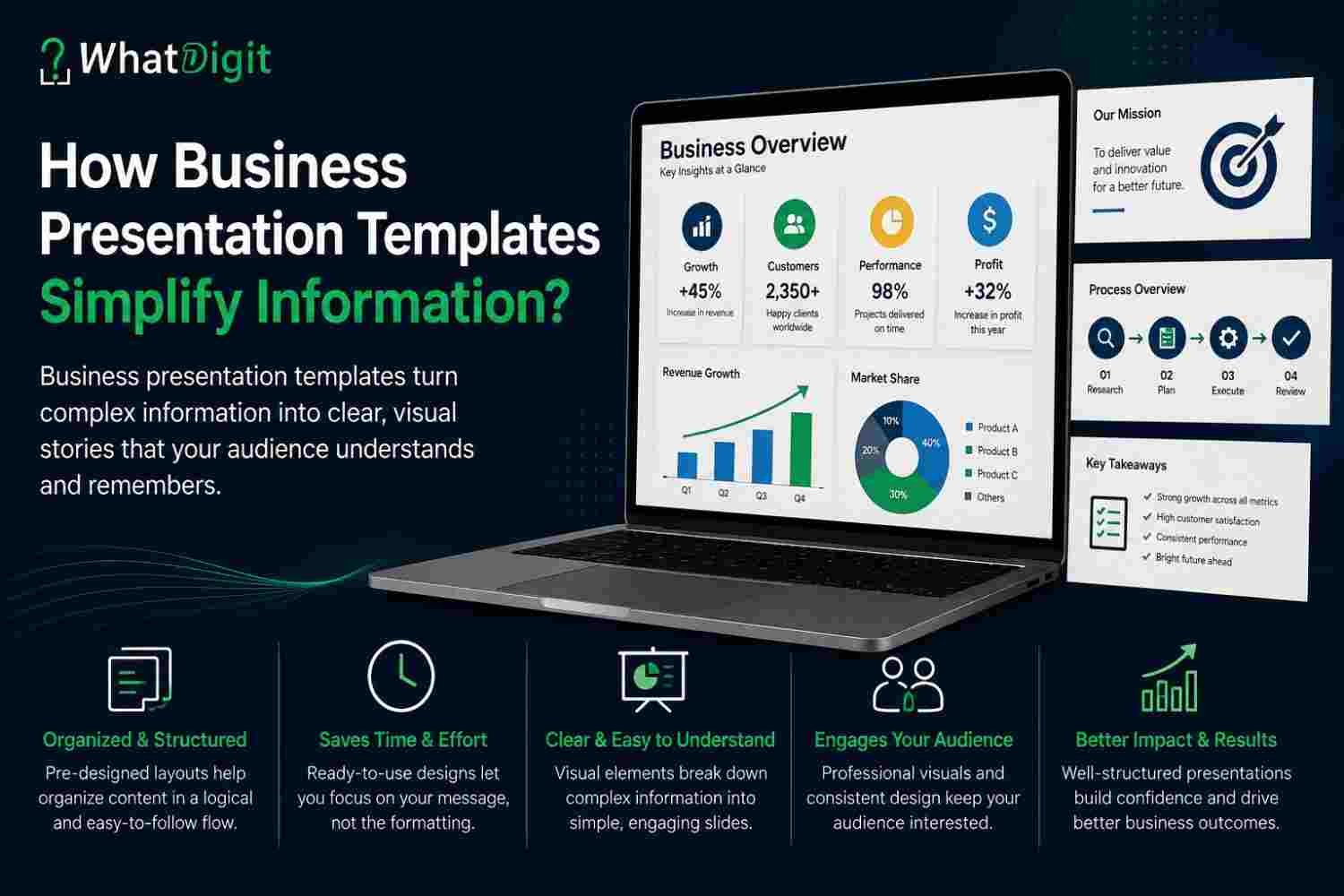
Business presentation templates make complex information easier to present by giving facts, analysis, and recommendations a clear visual structure. Instead of placing dense content on disconnected slides, presenters can organize ideas through defined sections, readable layouts, and appropriate visuals. For U.S. business owners, executives, analysts, consultants, and sales teams, this structure reduces preparation time while helping audiences follow the message. However, a template only provides the framework. Presenters must still verify the information, select relevant content, customize the design, and deliver the message with clarity.
Why Does Business Information Become Difficult to Present?
Complexity usually comes from volume, relationships, unfamiliar terminology, or competing priorities. A financial report may contain numerous figures, while a project update may combine schedules, risks, responsibilities, and decisions. Consequently, audiences can lose the central message even when every individual detail remains accurate.
Common presentation problems include:
Too many ideas on one slide
Weak connections between sections
Long paragraphs instead of prioritized points
Charts without readable labels or context
Inconsistent typography, colors, and spacing
Data presented without interpretation
Recommendations disconnected from findings
Technical language that does not suit the audience
Decorative graphics that compete with essential content
Missing summaries or requested decisions
A template addresses these problems by providing recognizable patterns. Titles signal the subject, layouts establish priority, and section slides show movement from one topic to another. Therefore, the audience spends less effort determining how information fits together.
How Templates Create Information Hierarchy
Information hierarchy shows audiences what to notice first, second, and third. Well-designed templates establish that hierarchy through placement, scale, contrast, spacing, and repetition.
Titles, Sections, and Visual Flow
A strong slide title communicates the main point rather than naming a broad subject. For example, “Operating Costs Declined After Process Changes” conveys more meaning than “Cost Update.” The supporting chart and explanation can then prove or qualify that statement.
Section dividers create another layer of organization. They separate background, analysis, recommendations, implementation, and expected outcomes. Moreover, consistent placement helps viewers anticipate where titles, evidence, and takeaways will appear.
Visual flow refers to the order in which the eye moves through a slide. Templates support logical flow by aligning related elements and leaving sufficient space around them. As a result, audiences can identify relationships without searching across an overcrowded canvas.
Layouts That Separate Essential Details
Reusable layouts divide complicated subjects into manageable units. A comparison slide can separate two options, while a process layout can show sequential actions. Similarly, a matrix can position choices across two decision criteria.
Useful layout categories include:
Executive-summary layouts
Problem-and-solution structures
Before-and-after comparisons
Timelines and milestone views
Process and workflow diagrams
Financial performance layouts
Risk and priority matrices
Product or service comparisons
Recommendation and next-step slides
Question-and-decision pages
The presenter should select a layout because it matches the information, not because it looks impressive. Function-focused design clarifies relationships; decorative design may add visual interest without improving meaning.
How Visual Structure Reduces Cognitive Load
Cognitive load describes the mental effort required to process information. Presentations create unnecessary load when viewers must decode inconsistent formatting, crowded charts, or unclear relationships before considering the actual message.
Templates reduce that burden through predictable design. When every slide follows a consistent system, audiences quickly recognize headings, key figures, supporting details, and action items. Consequently, they can focus on evaluating the content.
Several design choices support easier processing:
Present one principal message on each slide.
Group related information within visible boundaries.
Use contrast to distinguish priority from support.
Maintain consistent alignment and spacing.
Replace repeated explanations with clear visuals.
Remove elements that add no informational value.
Use labels that explain what data represents.
Repeat navigation cues across longer presentations.
However, reducing content does not mean removing necessary context. Presenters should preserve assumptions, limitations, definitions, and sources when those details affect interpretation. They can move supporting material to an appendix when the main discussion does not require it.
Using Visuals to Clarify Data and Relationships
Visuals simplify information when they reveal comparisons, sequences, proportions, connections, or changes more efficiently than paragraphs. Nevertheless, the presenter must match each visual format to the question being answered.
Charts and Graphs
Charts convert numeric information into visible patterns. Bar charts usually support category comparisons, while line charts show change across time. Additionally, stacked bars can show composition, and scatter plots can reveal relationships between two numeric measures.
A readable chart should include:
A descriptive title
Clearly named measures
Legible axis labels
Consistent units
Sufficient color contrast
Direct labels where practical
Necessary benchmarks or targets
A concise takeaway
Presenters should avoid three-dimensional effects, unnecessary gridlines, excessive colors, and truncated scales that distort differences. Moreover, a chart should never imply a conclusion that the underlying data cannot support.
Financial presentations particularly benefit from controlled chart layouts. Revenue, expenses, margins, cash position, budgets, and forecasts require clear periods and units. Therefore, presenters should state whether figures reflect actual results, estimates, targets, or projections.
Timelines, Diagrams, and Process Visuals
Timelines work well for milestones, phases, deadlines, and historical developments. Process diagrams show how work moves between steps, while relationship diagrams show how people, systems, or ideas connect.
A process visual should emphasize the path that matters to the audience. If every exception and secondary activity appears on the main slide, the diagram can become harder to process than written text. Consequently, presenters should keep the primary flow visible and place detailed variations elsewhere.
Decision trees, funnels, road maps, and organizational diagrams also serve specific purposes. However, users should verify that the template allows them to add, remove, and rearrange components without breaking alignment.
Visual Storytelling Connects Ideas
Presentation storytelling does not require dramatic language. In business communication, it means arranging facts so audiences can follow the situation, problem, evidence, choices, and proposed action.
A practical narrative may follow this sequence:
Establish the business context.
Define the relevant problem or opportunity.
Present evidence and contributing factors.
Compare possible responses.
Recommend an action.
Explain implementation, risk, and measurement.
State the decision or support required.
Templates can provide layouts for every stage. Therefore, presenters do not need to invent a new structure for each proposal, project report, or strategic review.
Transitions between slides also matter. A slide should answer the question created by the preceding slide or introduce the issue addressed next. Meanwhile, section summaries can reconnect detailed analysis to the broader objective.
The Value of Executive-Summary Slides
An executive summary gives decision-makers the essential message before detailed analysis begins. It usually covers the situation, major finding, recommendation, expected effect, risk, and requested decision.
Templates improve executive summaries by reserving defined areas for each component. However, presenters should not shrink an entire presentation into unreadable text. A useful summary prioritizes decision-relevant information and directs viewers to supporting slides when necessary.
Effective executive summaries often include:
The purpose of the presentation
Two or three important findings
The recommended response
Financial or operational implications
Major risks or dependencies
The immediate decision required
Executives may read the summary without attending the full presentation. Consequently, its statements should remain accurate and meaningful outside the surrounding discussion.
Applications Across Business Functions
Adaptable presentation templates support recurring communication across departments. Each function can use the same design system while selecting layouts suited to its information.
Reports, Research, and Project Updates
Business analysts can organize research into objectives, methods, findings, implications, and recommendations. Project managers can present progress, milestones, budget status, risks, responsibilities, and required decisions.
Operations teams may use templates for performance reviews, process changes, capacity planning, and quality updates. Meanwhile, human resources teams can structure workforce planning, policy communication, training, and organizational changes.
For every use case, presenters should distinguish facts from assumptions and recommendations. A colored label or consistent heading style can help identify each type, but design should never blur uncertainty.
Proposals, Pitches, and Sales Presentations
Proposal templates help businesses connect customer needs with an appropriate approach, scope, schedule, proof, and commercial terms. Similarly, investor pitches can organize the opportunity, business model, market context, operating plan, financial assumptions, risks, and funding request.
Sales teams should emphasize customer problems and relevant outcomes rather than filling slides with product features. A flexible template can include spaces for:
Customer priorities
Current operating challenges
Proposed capabilities
Relevant benefits
Implementation steps
Supporting evidence
Commercial considerations
Clear next actions
Nevertheless, no layout can compensate for an irrelevant offer or unsupported claim. Presenters must tailor the message to the specific customer and avoid presenting assumptions as confirmed needs.
Consulting and Training Materials
Consultants can organize findings through issue trees, comparison layouts, matrices, road maps, and recommendation pages. These structures help clients trace how evidence leads to a proposed response.
Trainers can divide complicated subjects into modules, objectives, examples, exercises, recaps, and knowledge checks. Moreover, consistent layouts help participants recognize when the material shifts from explanation to activity.
Templates also support repetition across multiple sessions. However, trainers should adjust pacing, terminology, examples, and activity difficulty for the participants rather than reusing identical material without review.
How Templates Improve Team Collaboration
A shared template gives departments a common design and messaging framework. Contributors can focus on their assigned content instead of making separate decisions about fonts, colors, margins, and layout.
Templates can define:
Approved title and body styles
Brand colors and graphic treatments
Standard chart formats
Image placement rules
Common section sequences
Footer and confidentiality areas
Accessibility expectations
Review and approval stages
Consequently, teams can combine slides with fewer formatting conflicts. Project leaders can also review logic and accuracy more efficiently because design variations do not distract from the content.
Version control still requires discipline. Teams should name files clearly, assign slide owners, track approvals, and identify the current version. Additionally, they should remove outdated slides from shared libraries so employees do not reuse obsolete figures or claims.
Reusability, Customization, and Preparation Time
Reusable layouts reduce repeated design work. Once teams establish suitable structures for summaries, charts, comparisons, and action plans, presenters can adapt them for later reports or meetings.
Someone planning to buy business presentations template online in USA markets should assess whether the collection supports real communication tasks rather than counting decorative slide variations. A smaller set of flexible, purpose-built layouts may offer greater value than hundreds of pages with limited editing options.
Customization should address both content and design. Users may need to change:
Slide order and section structure
Titles and narrative sequence
Colors and typography
Charts and data labels
Icons and illustrations
Page dimensions
Audience terminology
Evidence and examples
Calls to action
Appendix material
Startups and small businesses can adapt a single design system for proposals, internal reviews, sales pitches, and project updates. Larger teams may create controlled variations for separate departments while preserving a recognizable brand identity.
Accessibility and Readability Requirements
Accessible slides help more audience members read and interpret the content. Accessibility also improves general communication, especially in large rooms, virtual meetings, and mobile viewing conditions.
Practical considerations include:
Strong contrast between text and background
Body text large enough for the setting
Clear chart labels and units
Color choices that do not carry meaning alone
Descriptive titles
Simple reading order
Alternative text where supported
Limited motion and distracting effects
Captions or transcripts for media
Adequate spacing around content
Presenters should not assume that a fashionable design remains readable. For example, pale text on a photograph may fail under projection, while tiny footnotes may disappear during screen sharing.
Templates can establish accessible defaults, but customization may introduce new problems. Therefore, users should review every finished slide in the actual presentation mode and test critical pages on the expected display.
Comparing Template Options
Templates differ in flexibility, purpose, quality, and rights. Buyers should compare how each collection supports real work rather than judging it solely through preview images.
Premium, Free, and From-Scratch Designs
Free templates may suit occasional or low-risk presentations. However, they sometimes offer limited layouts, unclear rights, inconsistent graphics, or fewer customization options. Premium collections may provide broader structures, better documentation, and more coherent design systems, although price alone does not establish quality.
Building from scratch gives experienced designers complete control. In contrast, it requires more time and stronger design judgment. Templates offer a middle path by supplying a visual framework that users can adapt.
Customizable templates generally provide more lasting value than fixed designs because users can change hierarchy, layouts, colors, and content. Nevertheless, extensive customization may become inefficient when the original design differs greatly from the intended purpose.
Quality Indicators and Warning Signs
A high-quality collection connects each layout to a business communication purpose. It also makes editing predictable and preserves alignment when users change content.
Positive signs include:
Logical layout categories
Editable charts and graphics
Consistent spacing and typography
Multiple information-density options
Readable sample slides
Common aspect ratios
Clear font information
Practical instructions
Accessible color choices
Defined usage rights
Warning signs include excessive decoration, duplicate layouts, flattened graphics, missing fonts, vague licensing, unreadable charts, outdated visual conventions, and designs that depend heavily on animation. Buyers should also avoid collections that promise funding, sales, approval, or audience engagement.
Technical and Licensing Considerations
Technical compatibility determines whether users can edit a template efficiently. Buyers should confirm the file format, supported software, aspect ratio, font requirements, and graphic type before purchasing.
Widescreen dimensions generally suit modern displays, while standard dimensions may fit older equipment or certain printed materials. Teams should verify the required format before building the presentation because changing dimensions later can distort layouts.
Buyers should also determine whether graphics use editable shapes, linked assets, or fixed images. Moreover, they should check whether charts accept new data and whether the collection includes icons with consistent visual styles.
Licensing questions may include:
Can one person or an entire team use the files?
May an agency adapt slides for client work?
Does the license permit commercial presentations?
Can users modify every component?
Does the license prohibit redistribution or resale?
Do external graphics carry separate restrictions?
Will purchasers receive future updates?
How long will download access remain available?
Usage rights vary, so buyers should read the actual license and seek appropriate advice when necessary.
A Practical Pre-Purchase Evaluation Checklist
A structured review helps buyers compare functionality, compatibility, and long-term usefulness. Before selecting a collection, consider these questions:
Which presentations will the template support?
Does the visual style fit the intended audience?
Can users change layouts without design problems?
Are charts, timelines, and diagrams fully editable?
Does the collection include useful summary slides?
Are font files or suitable alternatives available?
Does the format work with existing systems?
Are widescreen and other needed ratios included?
Can teams apply their colors and identity?
Do slides support readable text and contrast?
Are usage rights stated clearly?
May several employees or clients use the files?
Does the seller explain update access?
Are layouts genuinely different or merely decorative?
Will the design remain usable after substantial editing?
The best choice should reduce recurring effort while preserving control. Therefore, buyers should test sample slides with realistic content whenever possible.
Common Template Mistakes to Avoid
Templates create problems when users follow the design more closely than the communication objective. Common mistakes include:
Filling every available placeholder
Keeping irrelevant sample content
Using the same layout repeatedly
Selecting visuals that misrepresent data
Shrinking text to fit excessive detail
Mixing unrelated icon styles
Adding too many colors
Relying on animation for meaning
Ignoring accessibility
Presenting unsupported conclusions
Failing to rehearse the final presentation
Presenters should remove unnecessary content before reducing font size or compressing spacing. Furthermore, they should split overloaded slides when separate ideas require independent attention.
A template may require extensive customization for specialized industries, unusual data, confidential transactions, regulatory communication, or highly differentiated brand systems. In those situations, a custom design may provide greater efficiency and control.
Design Supports Content but Cannot Replace It.
Presentation design can clarify accurate reasoning, but it cannot repair incorrect figures, weak analysis, or an unclear objective. A polished chart may even make unsupported information appear more convincing, which increases the presenter’s responsibility to verify every claim.
Before finalizing slides, teams should confirm:
Data accuracy and calculation methods
Definitions and reporting periods
Assumptions and limitations
Audience relevance
Logical connections between findings and recommendations
Consistency between spoken and visual messages
Ownership of required actions
Realistic schedules and next steps
Delivery also affects results. Presenters should rehearse transitions, explain visuals without reading them word for word, and leave appropriate time for questions. Ultimately, outcomes depend on content quality, customization, audience context, presentation skills, and the decisions under consideration.
Conclusion
Business presentation templates make difficult information easier to communicate by imposing structure, hierarchy, consistency, and visual order. Adaptable layouts help presenters separate essential points, select suitable visuals, and connect evidence with action. However, design quality cannot replace accurate data, relevant analysis, audience awareness, or confident delivery.
A functional template should provide editable components, readable formatting, appropriate usage rights, and enough flexibility for different communication goals. When users customize that framework thoughtfully, they can prepare clearer proposals, reports, pitches, and internal updates without allowing decoration to overpower meaning.
FAQs
What is a business presentation template?
A business presentation template is a reusable set of slide layouts designed for professional communication. It usually defines typography, colors, spacing, visual hierarchy, and common content structures. Users replace sample material with their own information while adapting the layouts for reports, proposals, meetings, training sessions, or pitches.
How do presentation templates simplify complex information?
Presentation templates simplify complex information by dividing it into organized sections and recognizable visual patterns. Titles, charts, timelines, diagrams, and summary layouts help audiences identify priorities and relationships. However, presenters must still select the right facts, remove unnecessary detail, and arrange the message around a clear objective.
Are premium business presentation templates worth purchasing?
Premium templates can justify their cost when they provide editable graphics, useful business layouts, reliable formatting, clear rights, and broad reuse. However, buyers should not assume that a higher price proves quality. The collection must fit the audience, technical environment, communication needs, and expected frequency of use.
What features should a business presentation template include?
A useful business presentation template should include executive summaries, section dividers, charts, comparisons, timelines, process diagrams, recommendations, and next-step layouts. It should also provide editable elements, readable typography, consistent spacing, accessible contrast, suitable aspect ratios, and formats compatible with the user’s existing presentation workflow.
Can one template support several types of presentations?
One flexible template can support proposals, reports, pitches, training materials, and internal meetings. Users can reorder sections, replace graphics, adjust content density, and apply audience-specific language. However, specialized presentations may require extra layouts or substantial design changes when their information, brand requirements, or review processes differ significantly.
How much should users customize a presentation template?
Users should customize every element that affects meaning, audience relevance, or brand identity. This includes titles, sequence, data, colors, examples, visuals, terminology, and calls to action. They should preserve useful layout principles while removing sample material and decorative elements that do not support the presentation’s specific objective.
Do templates help presenters explain financial data?
Templates can make financial data easier to explain by providing structured charts, comparison layouts, summary metrics, and spaces for commentary. However, presenters must label periods, units, assumptions, targets, and projections accurately. They should also select visual formats that reveal relevant patterns without distorting differences or hiding important qualifications.
What mistakes should businesses avoid when using templates?
Businesses should avoid overcrowding slides, retaining irrelevant placeholders, shrinking text excessively, using inconsistent graphics, and selecting decorative visuals that obscure meaning. Additionally, teams should verify every figure, customize the narrative, check accessibility, confirm usage rights, and rehearse delivery rather than treating the template as a finished presentation.
How can presentation templates support brand consistency?
Presentation templates support brand consistency by defining approved colors, typography, spacing, logos, chart styles, and visual treatments. A shared system helps different departments produce recognizable materials. Nevertheless, teams should maintain version control and update shared files whenever brand standards, messaging, required notices, or visual assets change.
Are business presentation templates suitable for small businesses?
Business presentation templates suit small businesses because reusable layouts can reduce design time across proposals, sales meetings, reports, and training. A modest collection may serve several purposes when it offers strong customization. Small teams should prioritize practical layouts, editing flexibility, clear rights, compatibility, and readability over sheer slide quantity.
Comments (0)